Improving font rendering in old UI toolkits with a one line Pango patch
11 April 2023 ·Context
First let me give enough technical information to make this blog post comprehensible to newcomers, and then dive in with a little bit of history. Those already familiar with how font rendering works can skip the next section.
Font rendering basics
Most computer screens are made up of little square pixels. On most of these screens, each pixel is composed of three subpixels — vertical columns of red, green, and blue LEDs (usually in that order). In other words, the entire pixel is never “blue”; a pixel appears blue to you when its blue subpixel is turned on, and its red and green subpixels are turned off.
Modern fonts are vector based. This means that instead of being defined in terms of which pixels are to be turned on, and which are to be turned off, the font designer instead specifies precisely the shape of the corners and the curves for each glyph, and the font rendering system is responsible for deciding which pixels to activate. This is why you can zoom into the text on a webpage without it looking blurry or blocky.
So how does the font rendering system decide whether to turn a pixel on or off? Well, the simplest way to do that (for black text on a white background) is to pretend that the pixel is a square. Ask what portion of the square is “covered” by the glyph you are drawing; if that number is greater than 50%, make the pixel black. Otherwise, make it white. Unfortunately this looks terrible. The pixels on almost every screen are large enough that if you draw fonts this way, you’ll be able to see the blocky pixel edges.
The solution is called anti-aliasing. As a bit of a simplification, you can imagine that instead of drawing each pixel black or white, you instead take the percentage of the pixel that is covered by the glyph and make the pixel that fraction black. So if the 75% of the pixel is covered by the glyph, you set the pixel to 0.25 * maximum brightness (all white).
This is complicated slightly by subpixel anti-aliasing. On many screens, especially older ones, the pixels are still large enough that the text is hard to read or blurry when you render this way. However, remember how I said that each pixel actually has three vertical subpixels? What if your renderer treated each of these as separate for the purpose of anti-aliasing? It would then be able to increase the horizontal resolution of text by 3 times! That’s exactly what subpixel anti-aliasing is.
Done naively, this results in strong color fringing on the edge of characters, since if the left edge of a character is just barely in a pixel, you have to activate the “blue” subpixel (on the pixel’s right edge), and not the green or red ones. So it’s usually combined with what’s called LCD filtering, which is a set of complicated techniques for adjusting the anti-aliasing so as to minimize these color fringes as much as possible. The resulting approach has been around for decades now, most prominently as Microsoft’s ClearType. More generally, it’s also sometimes called subpixel rendering, although I find that label unhelpful.
I say all that because these techniques are well known, and it’s important to clarify that I’m talking about something different that has been around on most operating systems for much less time. Let me introduce this concept with a new question: where on the screen can you place a glyph?
This may seem like a silly question, but hold on. My screen has 1920 pixels in each row. Does that mean that there are 1920 positions at which a font renderer could insert an “a” character, for instance? No. Imagine looking at a book, which we’ll say is printed with traditional hot metal typesetting. No pixels were involved anywhere in this process. There was only the right place to put the “a”, and an infinite number of wrong places. Will the right place to put each glyph always align with the same position relative to the pixel? Of course not!
But that’s exactly what most font rendering engines assumed, for years and years. (Turns out there are good reasons to do this: it improves performance by reducing the size of the font cache.) “Wait,” you might say. “Old screens had huge pixels! Didn’t this look terrible?” Yes. Yes it did. But there were bigger problems; with huge pixels, complex vector fonts can be very hard to read. To fix this, font renderers adopted a technique we haven’t discussed yet called hinting. This basically amounts to mangling the shape of each glyph so that it aligns better with the pixel edges. The result is sharper, sometimes easier-to-read text. Strong hinting is a key component of ClearType, whereas macOS is famous for doing little or no hinting in order to better preserve glyph shape. For our purposes, all that it’s important to know is that after distorting glyphs to fit the screen pixels, it doesn’t matter so much what the correct pixel offsets are. Getting them right might even be counterproductive if it makes the glyph blurrier.
So for a while, there was little reason to bother with subpixel positioning (as opposed to subpixel rendering, discussed above). But times changed, screens improved, and now it’s important. This is in part because hinting has fallen out of fashion, except on desktop Windows.
If you would like to learn more about these topics, the best introduction I know is the slightly outdated Treatise on Font Rasterisation.
A brief technical history
In 2019, the text rendering library Pango finally released with support for subpixel positioning, enabled by default. This had made many people very angry and has been widely regarded as a bad move.
The issue is that Pango depends on another library called Cairo, and at the point when Pango released this feature, Cairo did not yet support it. The result, if you had the most recent releases of both Pango and Cairo, was “unpleasantly uneven glyph placement” to quote the Pango developer. As a consequence, they reverted the change in Pango 1.44.3. Unfortunately, this decision was never revisited. Programs (and UI toolkits) must still opt in to subpixel positioning, despite the fact that a version of Cairo that supports it was released years ago now.
Recent UI toolkits (like Qt or GTK) either enable subpixel positioning support in Pango (GTK) or implement it themselves (Qt). However, not all software uses the latest versions of these toolkits. How serious is this problem?
For Qt it’s not that bad. Both Qt 5 and 6 support subpixel positioning, which covers the vast majority of applications. However, only GTK 4 enables it. That leaves GTK 2 and GTK 3. Is this an issue in practice?
As of April 2023, on Arch Linux,
- 86 packages require GTK 4
- 561 packages require GTK 3
- 125 packages require GTK 2
Note that this is only a rough estimate, for a variety of reasons. It suggests a bad state of affairs, nonetheless. Only ~11% of packages that require one of GTK 2/3/4 depend on GTK 4. This is surprising, since the last major release of GTK 2 was in January 2011, and it was officially end-of-lifed in 2020, but it’s what we have to deal with. It probably makes sense to plan on supporting GTK 3 applications indefinitely.
I asked the GTK developers about adding support for subpixel positioning to GTK 3, but they said that development focus was entirely on GTK 4 and that GTK 3 wouldn’t receive new features. That puts us at something of an impasse. The Pango developers haven’t made subpixel positioning the default. GTK developers are only working on GTK 4. And the vast majority of GTK applications are using GTK 2 or 3.
Let’s fix it ourselves
Applications using pango are supposed to call
pango_context_set_round_glyph_positions (context, FALSE)
to disable rounding glyph positions to whole pixels. If an application doesn’t set the option, it falls back on Pango’s default (rounded positions, so no subpixel positioning). Hold on, though. The legacy UI frameworks aren’t explicitly disabling subpixel positioning — they’re just not enabling it. So if we change the default in Pango, we’ll immediately get everything using Pango working, for free!
Turns out this is a one line code change.
diff --git a/pango/pango-context.c b/pango/pango-context.c
index cbc4f173..82b44136 100644
--- a/pango/pango-context.c
+++ b/pango/pango-context.c
@@ -69,7 +69,7 @@ pango_context_init (PangoContext *context)
context->set_language = NULL;
context->language = pango_language_get_default ();
context->font_map = NULL;
-  context->round_glyph_positions = TRUE;
+  context->round_glyph_positions = FALSE;

context->font_desc = pango_font_description_new ();
pango_font_description_set_family_static (context->font_desc, "serif");
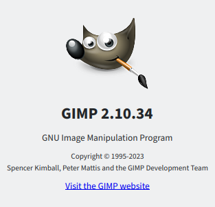
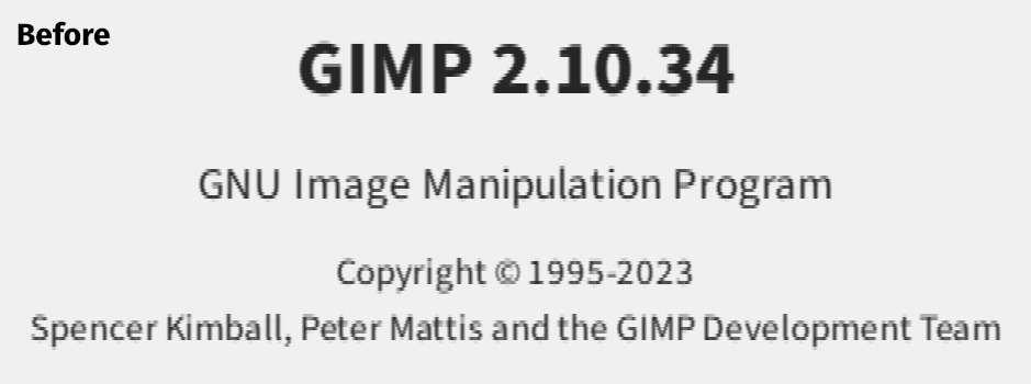
Starting applications after compiling in this change was nothing short of stunning. I think my jaw actually dropped. (Note: the “large text” images are redrawn from actual screenshots by treating each vertical subpixel like a 3x1 grayscale pixel.
The Quod Libet music player (gif):

The GIMP about screen (before):

The GIMP about screen (after):
A gif close-up. Note: since my blog shrinks images to fit in the margins, the best way to look at this image is by opening it in a new tab.
That’s a huge difference! I’m going to add Pango to the slowly growing list of packages I have to build myself to include important patches. The results, though, are worth it.