LibreOffice 7.4 has a new approach to text rendering
18 August 2022 ·I’ve used LibreOffice for quick word processing tasks for years now — since before it was forked from OpenOffice in fact. However, for years I’ve drafted documents in another tool, before copying them into LibreOffice for the final export to PDF. The reason is that the font rendering in LibreOffice is infamous for how terrible it is, with a large number of issues reporting going back years.
As an example, one of these reports was mine.
Here’s a brief explanation of the problem. Fonts set the amount of space (called “tracking”) around each glyph. Certain combinations of characters do not look right with the default amount of space, and a feature called pair kerning allows a text renderer (like LibreOffice) to adjust this space for individual letter pairs. For instance, the large open bowl of the uppercase “C” looks too empty by default, so the next letter is often brought closer to it.
Unfortunately, LibreOffice’s rendering on low resolution screens was so bad that enabling pair kerning (it has been the default for many years) made it worse. In some cases the failure is catastrophic:
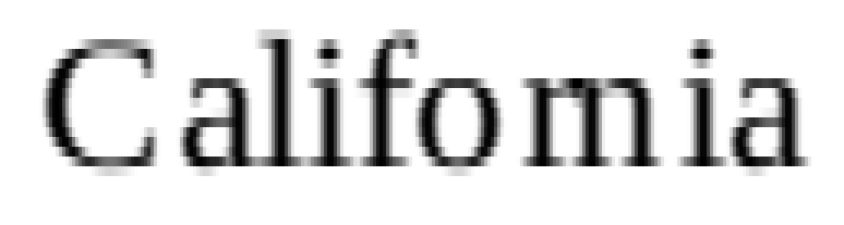
This is a real screenshot taken on my computer. I wrote software to upscale the image so that the problem is clear. Each individual (red, green, or blue) sub-pixel as shown on my screen is being re-rendered at nine times its original size, in grayscale. This helps to capture the effect of sub-pixel anti-aliasing, which uses the shape of the pixels on modern LCD screens to triple the effective horizontal resolution of the text. Here is the original screenshot, for comparison:

Pair kerning is implicated here because it is actually this feature, when enabled, that turns “California” into “Califomia”. The font shown here is Liberation Serif 12pt, at 120% page zoom. Hinting is disabled system-wide.
Why is text rendering on LibreOffice 7.3 so bad?
The problem was caused by an approach to text rendering that predates the introduction of the codebase into version control in the year 2000. Back then, text renderers were rather stupid, and did not do a good job of rendering strings of text in a readable way on the screen. LibreOffice (then OpenOffice) therefore did its own glyph positioning.
LibreOffice knew where the glyphs should go (called the printing position, because it was where the glyphs would be placed when sent to a high resolution output like a printer), but just sending these “ideal” locations to the text renderer would result in subpar text.
On the other hand, if LibreOffice rendered the text at the preferred screen position, the width of the text would not match up with the printer’s output (because the screen metrics of the font differ, e.g. due to hinting). LibreOffice is a WYSIWYG (what you see is what you get) editor, so this is unacceptable. Lines that exceed the word processor’s margins must reflow, so you would end up with cases where the printed document would have different lines than the document as shown on the screen.
Instead the authors adopted a compromise: 75% of each glyph’s placement is determined by the ideal position according to the screen metric, and 25% is determined by where the glyph would be placed if its right border was aligned with the right border of the ideal printing position. WYSIWYG is made possible by realigning the text with the printing position every time white space appears in the text.
Unfortunately, the end result is not very good by the standards of a decade later. On a low resolution screen like mine, pixels are quite large relative to the size of the glyphs:
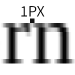
The above shows close to ideal kerning for the r/n letter combination for this font at 12pt on my screen. As you can see, being off by one pixel is enough to make “rn” into “m”.
Despite LibreOffice making its best effort to place glyphs intelligently, most of that work was thrown away at the last stage in the rendering process, because the glyph positioning engine did not support sub-pixel positioning. This is a different concept than sub-pixel anti-aliasing. While the font renderers used by LibreOffice have generally supported the latter, sub-pixel positioning support is much more recent. Sub-pixel anti-aliasing (sometimes more generally called sub-pixel rendering) is the use of the thin red, green, or blue components of LCD screen pixels to improve the resolution of text. Sub-pixel positioning uses anti-aliasing (potentially including sub-pixel anti-aliasing) in order to render text at positions more precise than a single pixel.
This is crucial to the proper appearance of text. Because pixels on low-resolution screens are so (relatively) large, rounding the location of glyphs to the nearest pixel generates consistently bad results. Combine that with pair kerning (which tends to move glyphs closer together, and also changes the heuristic described above to favor the printing position), and you’re asking for catastrophic failures.
What does LibreOffice 7.4 do differently?
For at least the last 22 years, LibreOffice has done its own glyph positioning under the assumption that the underlying font rasterization engines were not capable of creating high quality text on LCD screens when passed the “true” positions of each character (i.e. the printing positions).
This was true for most of LibreOffice’s history. After all, while rendering has been acceptable on Linux for at least a decade (with the proper settings and a recent enough FreeType), commonly used libraries like Pango / Cairo did not support sub-pixel positioning until very recently. Qt was ahead of the game for a long time, supporting it since some time around 2015.
During the LibreOffice 7.4 development cycle, Caolán McNamara experimented with this behavior, initially adding an option to just kick the printing positions down to the rasterizer and let it place them on the screen using its own algorithms. The result was successful enough and fixed so many bugs that it was made the default mode in LibreOffice 7.4.
Because the underlying rasterizers now support sub-pixel positioning, this change results in LibreOffice getting that for free, in addition to the intended change of eliminating the buggy positioning code from the render path.
The results are breathtaking:
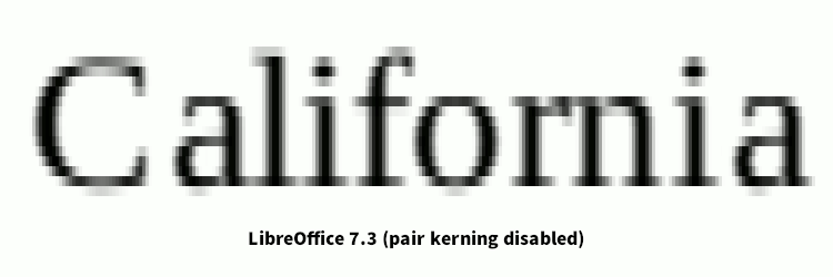
It’s rare to see such an enormous improvement in a piece of software in a minor version bump, and this one appears to have gone almost unnoticed. It’s even rarer to see an improvement like this with a simplifying change, in this case one that makes a bunch of old code irrelevant.
My thanks to Caolán McNamara for working on this, and for backporting the patches to LibreOffice 7.3 at my request. LibreOffice is now a viable choice for me when drafting documents.
I hesitate to share the following before and after picture of some text at the original size for fear it may be misconstrued. Don’t expect this text to look great on your system, even if you view it at 100% zoom (which you should — right click to open the image in a new tab). Font rendering happens at a very low level, relying on details like screen DPI and pixel orientation that may vary from screen to screen. This is also a bit of a stress test, rendering some serif fonts with many details on a low resolution device at 12pt.
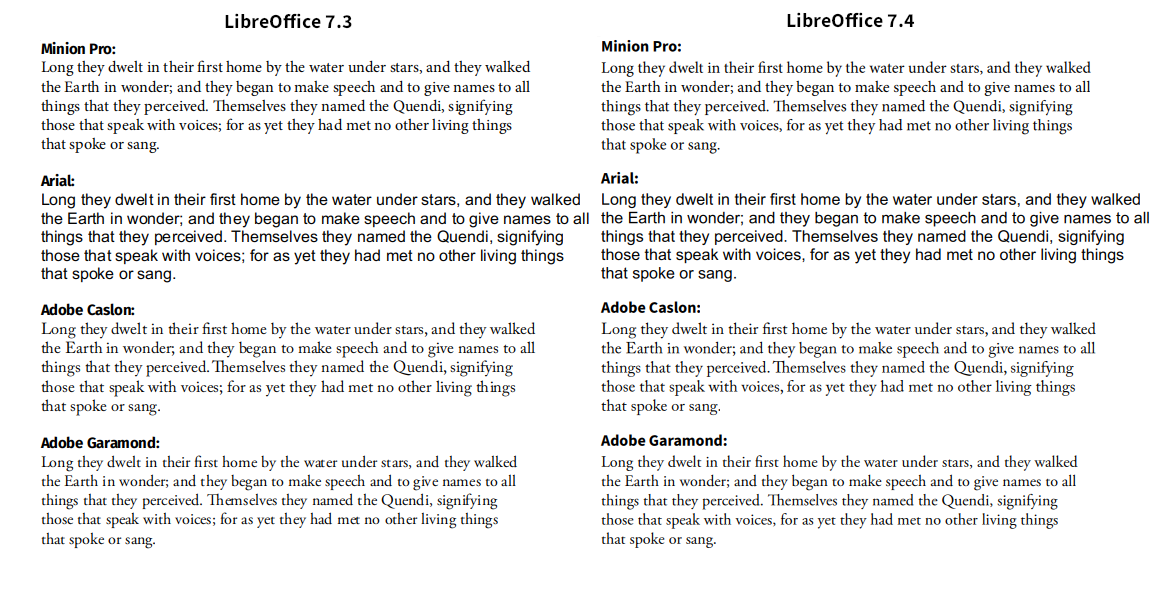
Rather than deciding which rendering looks better to you overall, focus on the differences in glyph placement. Where are the glyphs too close together? Where are there ugly gaps? To my eye, LibreOffice 7.4 has significantly reduced severe positioning errors (“met” in the fourth line of the Garamond sample) while achieving superior rendering even in cases where LibreOffice was already acceptable (every “th” pair is slightly too close in Caslon), thanks to sub-pixel positioning.